Start or not to start … Menu
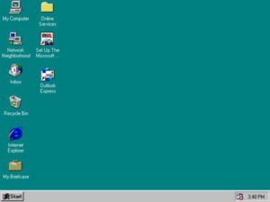
Start Menu Windows 95
Microsoft introduced Start Menu with the Windows 95 , and NT systems. To be exact it was the August 15, 1995 when Windows 95 RTM (Released to manufacturing) was introduced. It was the great step up from its predecessor Win 3.1.1, and it came with a central launching point for computer programs and performing other tasks. The one and only “Start Menu”. Besides Desktop it is the most visited place due to its usability and ease of access. As name suggests it was the start point for so many different tasks and tools. Most of all it was so easy for a user to rearrange it , and sort it that everyone loved it and considered it as a vital part of OS. That is from the user’s point of view.
Time traveling with Start menu
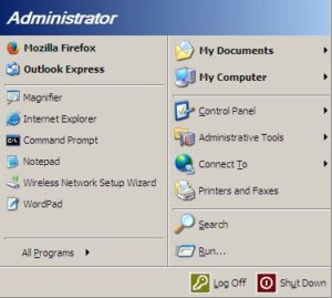
Windows XP Start
So, it came to us with 95, it stayed pretty much unchanged with 98, Millennium, and Windows 2000. Than it landed on XP in all of its magnificence and it became a standard. I think that if it disappeared then, most of the users would not know what to do with the computer. Programs, Administrative Tools, Run, Control Panel, Shutdown, it was all there few clicks away. Why would you take it away without offering a better solution?
Well it stayed a little bit more, but some wise guys in expensive suits that never spent a night in front of CRT were already thinking how to screw up as many people as possible and make it look great in company reports.
Time of the Kraken
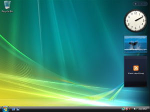
Windows Vista
Then in November 2006 Kraken came to haunt the computer hardware. It was called Windows Vista. Like usually Microsoft had a great idea, no time to finish it and they released it anyway. That memory eating monster required state of the art hardware to work decently, but was a game changer comparing to its predecessors. Then it was visible that major changes are happening at Microsoft, and that OS course is changing. Many differences and many great things came by, and fortunately some good stuff stayed , like the Start Menu. After Vista came 7 in July 2009.
The good times
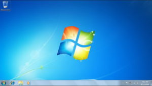
Windows 7
It came as a finished, polished and mature OS, and of course Start menu stayed again. It had great driver support and worked well on average hardware. Users had no problems getting used to it, and it caused no trauma to them. It really was one of the greatest Windows ever! This time guys from Redmond really hit the bull’s eye.
How it all went wrong…
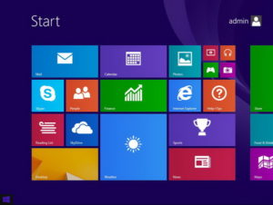
Windows 8.1
You know that situation when everything is like it should be…….. and then something terrible happens. That is when Windows 8 came in August 2012. It created mess and confusion among the users. Touch screen OS that run mainly on non touch screen devices. A cyborg like Vista that made more problems than it had solved. This one really disappointed me. Main reason was lack of the Start Menu and it tried to make me change 17 years old habits. Was it necessary ? Was there a chance to leave it be as an option? No, great guys in Microsoft said that now you have a tiles and you can go to right end of screen for additional options. Options for Search , Logout, Restart, Shutdown……. What the hell ?!
Screw users big, screw Admins bigger
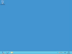
Server 2012
And if that was not enough there was something for the IT professionals also called Windows Server 2012. In peak of virtualization era in IT industry, some great geniuses created server OS for touch screen. You seen many VMs with touch screen? 🙂 Great, no Start Menu, if you want any basic things put your cursor to the right, near the end of the screen. In case many installed programs you can use search to find what you need. That is if you know the name of app that you want. I ended up with browsing thru both Program Files directories. It was easier to find and open app that way. All hail Windows 8 and Server 2012.
They heard us
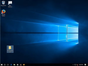
Windows 10
Microsoft figured its mistake in Windows 8 and tried to heal the wound with 8.1. Someone finally noticed users unhappiness and we got our Start back with last Windows versions. Windows 10 , Servers 2012 R2 and 2016 are proof that Start Menu is still a good concept. Unless something radically new happens, Start may be modified, but basic concept stays. And guys, please take a notice that Servers are not for great looking. As their name suggests they serve some purpose, so stop changing names of the tools, and locations of things. Use that time and effort to make useful improvements like you did by adding pause coping option in Win 8 or PowerShell in Server 2008 or SDS in 2K12R2 and 2K16.
Additional comment
I chose Start menu as an example. These days vendors will do just about anything in order to grow and keep users and customers. Sometimes they do just the opposite, and that would not be the problem if it would be noticed and corrected ASAP. But like in this example we had to wait some years until wrong people at the right positions come to their senses. We can only hope that big guys will start using methods and tools they so much advice for us and therefore be informed about users needs and habits. We all know that habits can be really hard to overcome. At the end both of the worlds need to exist together in symbiosis and harmony, but world of producers needs to make the first step.
Some legacy to remember:
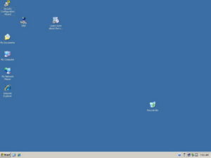
Windows Server 2003
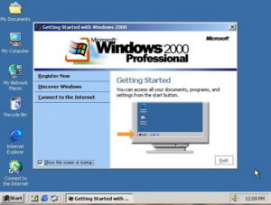
Microsoft Windows 2000
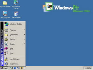
Windows Millennium
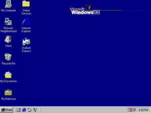
Win 98
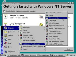
Windows NT server
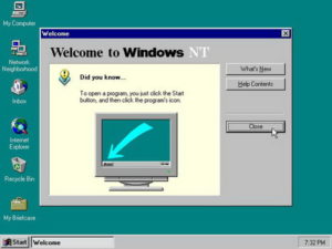
Windows NT
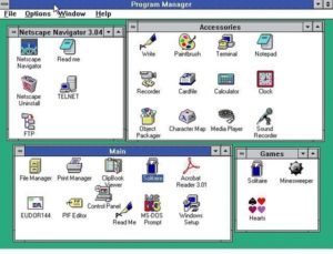
Microsoft Windows 3.11
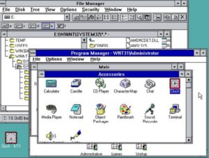
Microsoft Windows 3.1
There is also a report from one of the Microsoft conferences.
Once again thank you for reading.

🙂

